MUSINGS
Chasers started as Tim DeMello's vision for a modern strategy game designed to stand alongside Checkers and Chess. As the game evolved with our team and Cardimundi’s design of the mover pieces, the brand needed a brand to reflect it. Once the rules and game play were locked, I partnered with him to design the brand, logo, game board, and companion mobile app.
Early explorations surfaced themes of dominance, combat, and intensity. The goal was to translate strategic competition into something bold, chunky, and unapologetic.
I love a good Easter egg.
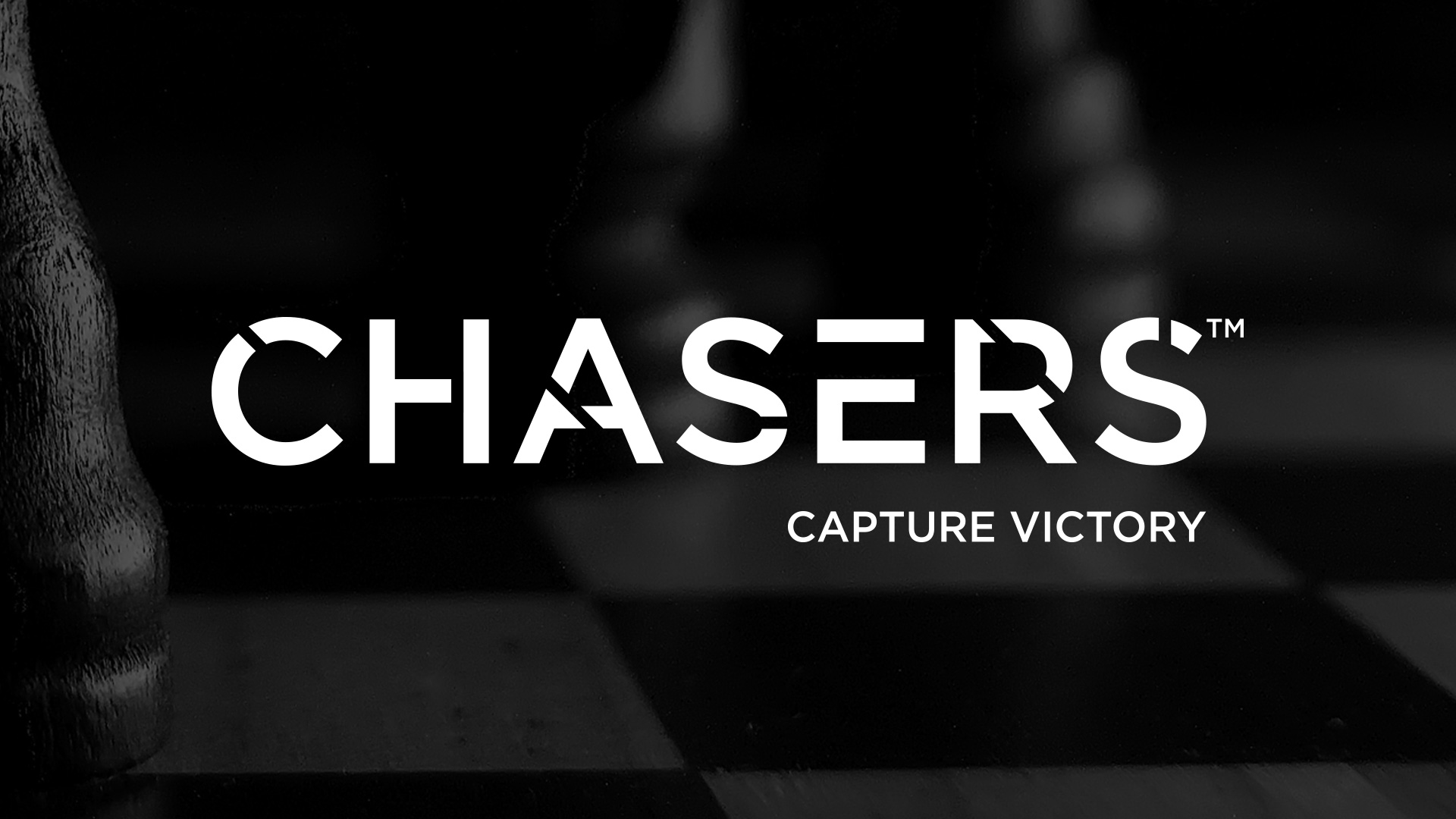
The Chasers wordmark is custom-built with a stenciled construction and slashed letterforms. Those cuts aren’t decorative—they reference game play. Each slash subtly encodes game play on how pieces can travel: horizontal, vertical, and diagonal.
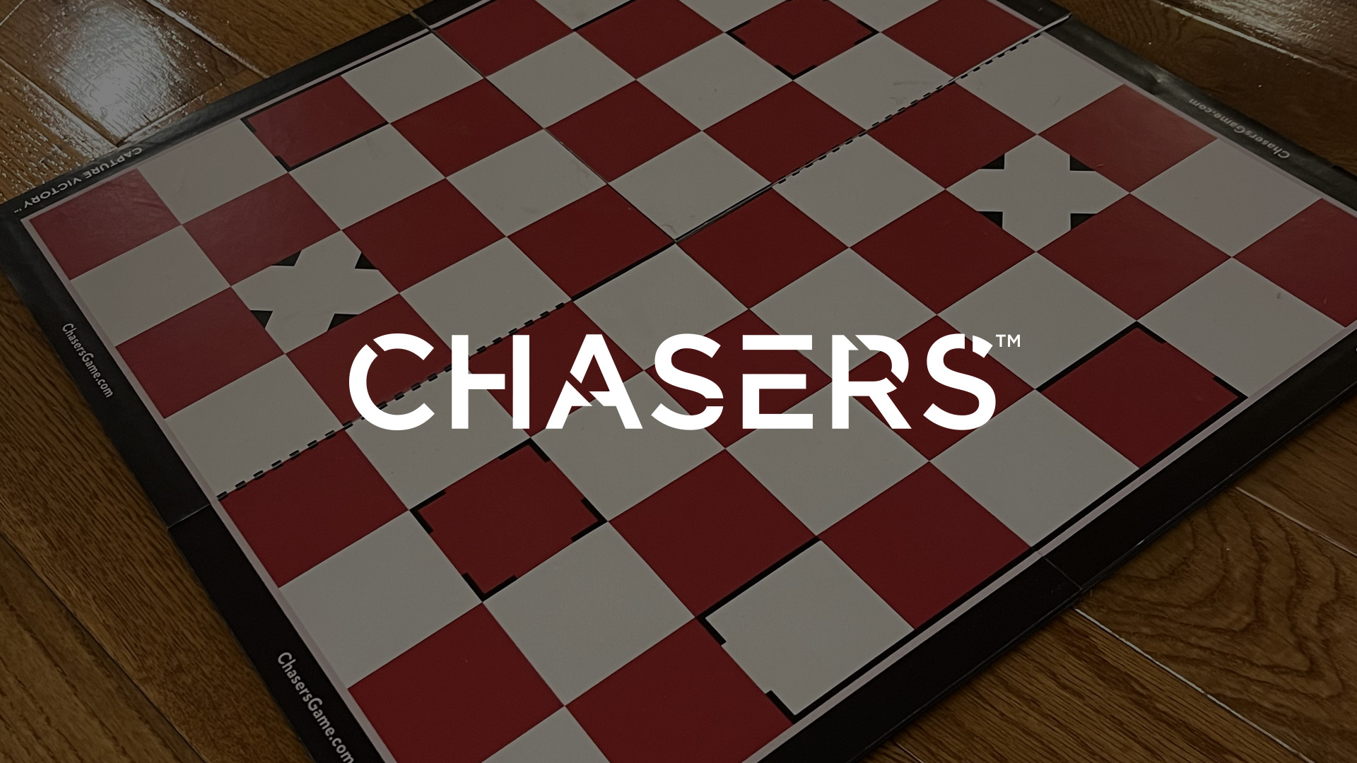
The result is a logo that encodes movement, energy, and strategy while feeling durable and timeless—cementing Chasers as the third piece in a classic game trilogy.

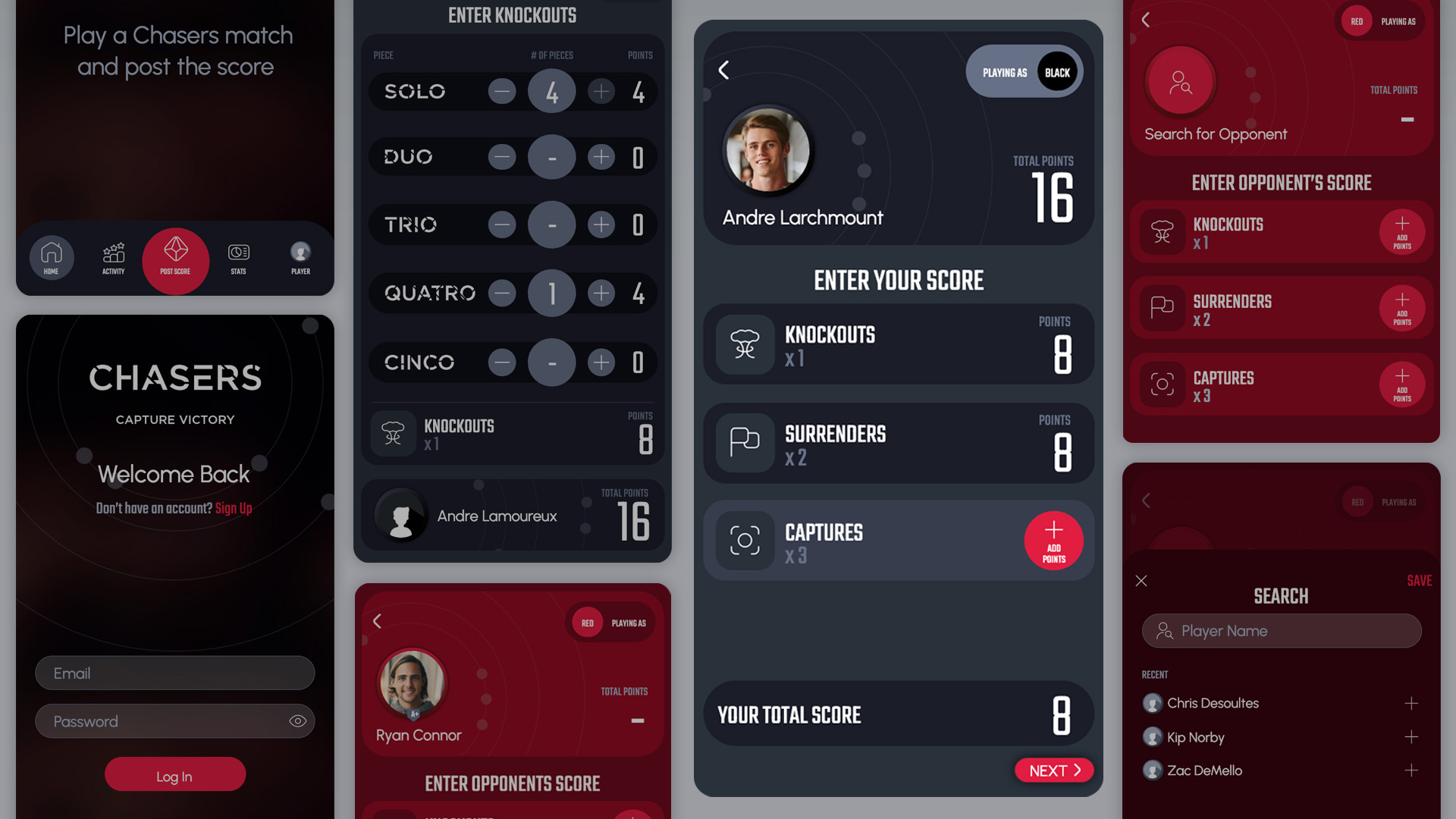
The digital companion app extends the Chasers experience beyond the board with score keeping and leaderboard rankings.

The system leans into dynamic color, dominant typography, and bold iconography to reinforce competition and momentum. Every detail supports an assertive, energetic feel that mirrors the strategic nature of the game which is to capture victory.
More coming soon...